
For this infographic I used Canva and Adobe Spark. I made the graphs on Canva and then put them together on Adobe Spark. I think that Canva is the easiest place to make charts and graphs but I think that it seriously limits design and is not always the best for showing a lot of data. I had tried to make home ownership by race an area chart but found it to be incredibly difficult and had to switch it to a line chart.
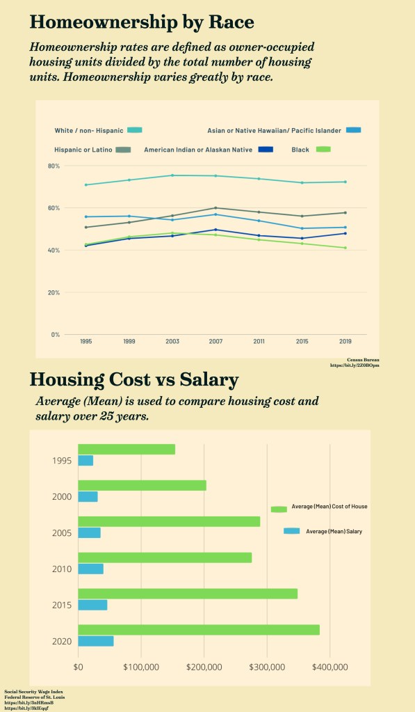
I continued to make charts and graphs about housing because I think housing inequality is interesting but also because it is something that is always surveyed in the US Census. I was able to find data from a number of years ago, so I got the freedom to choose what years I wanted to focus on. I chose the last 25 (from the 2020 Census) because I thought it was a fair amount of time to show patterns and trends. I didn’t think that 10 years was an accurate representation of some noticeable phenomenon: Black homeownership has been declining for a number of years, White/ non- Hispanic homeownership is considerably higher than any other race, and housing cost has been steadily increasing while total wages/salary has remained relatively consistent over the last 25 years.
It took me about 45 minutes to research the data I wanted to use and think about how I wanted to display it. It took me much longer (2-3 hours )to design the infographic as I had some difficulties designing the graphs themselves, with the large amount of data (as opposed to raw statistics). With 25 years of data I had to decide what increments of years to use as well because I was limited with spacing. Formatting the text proved to be time consuming as well, because those the graph’s axis are self explanatory they still needed titles and their sources cited. I chose a very minimal color palette because I was concerned that it would already be difficult to read my line chart, especially where the lines intersected.
In comparison to last week, I found this week to be more difficult because I had to make two different graphs. I enjoyed the challenge to visualize the data but I still think I have room to improve. If I were to put the two graphs and charts I made last week and these two together on an infographic I think I’d have a decently aesthetic and comprehensive look at housing in America.
