
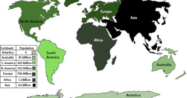
To create my infographic, I used Adobe Photoshop. I found a black and white image of the continents off of Google Images and then used it as my canvas. The original image was just the continents, no labels or anything else. I had some trouble with the design on Photoshop, but nothing major. I am just still getting used to the program and how to use it properly.
I researched this topic on Google and found my information from a credible source. It took me about 10-15 minutes to research and about 1.5-2 hours to make. First, I organized my data and then filled each continent with an appropriate color. As the population increased, I chose a darker shade of my original color. I then made my table with shapes and inserted all of my data, this was the trickiest part for some reason as I am not used to doing the whole thing by hand.
References:
