
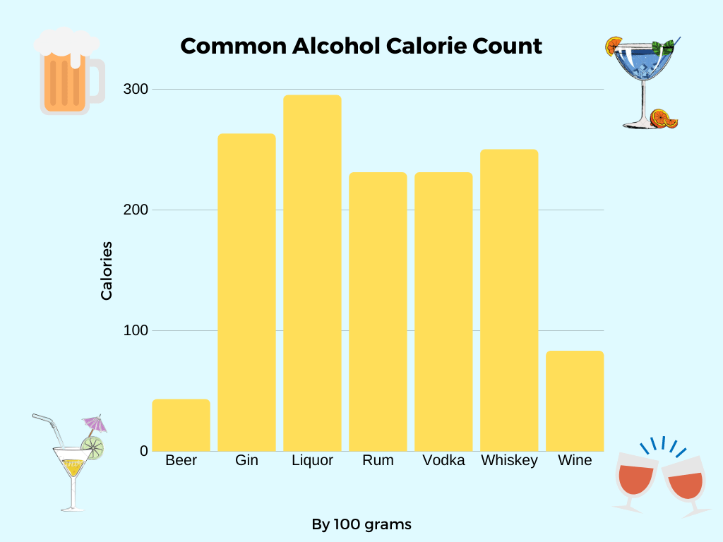
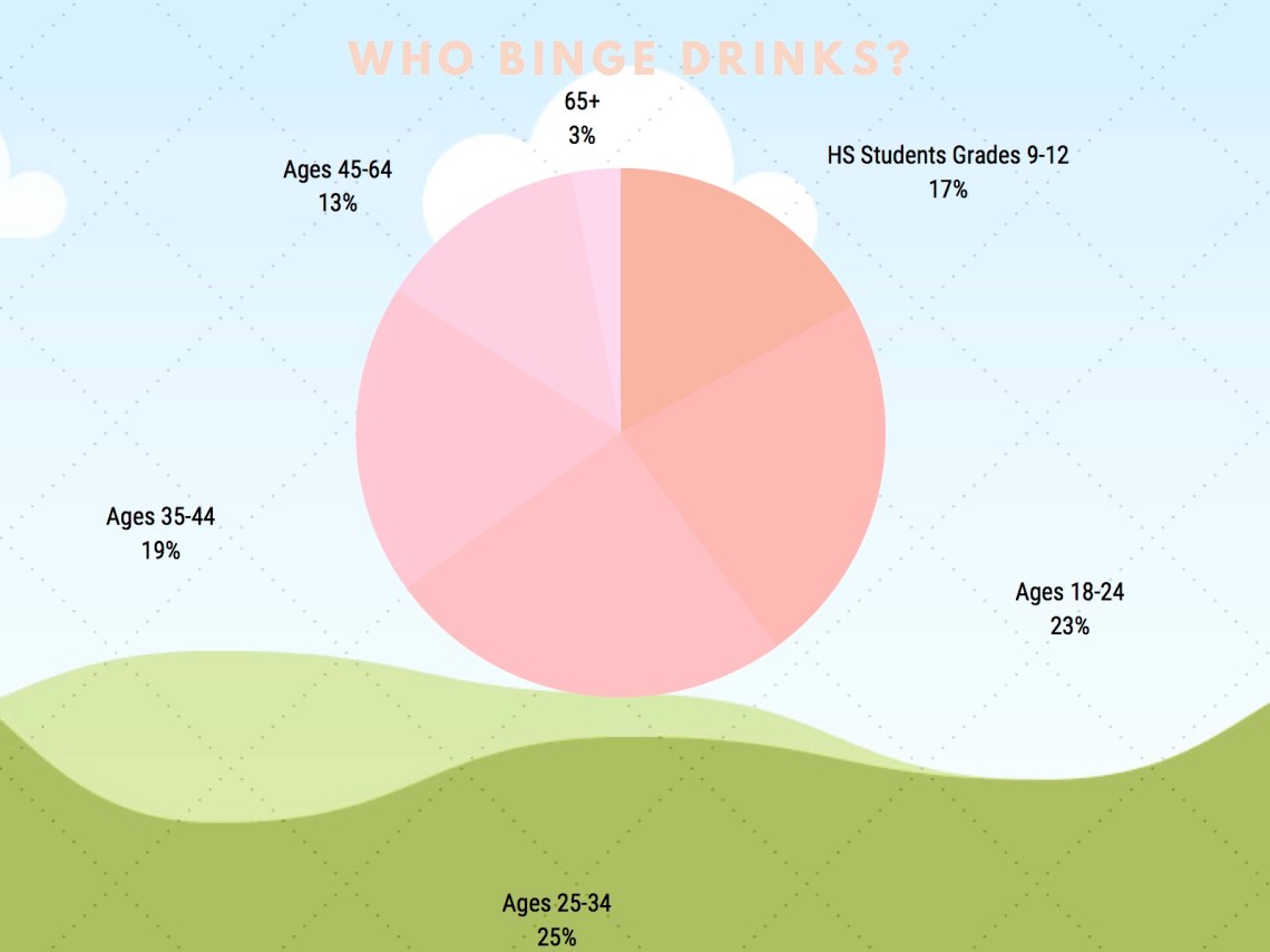
For this assignment of Charts and Graphs I actually decided to use Canva this time. At times having trouble with the customization, the easiest part was actually entering in the data. It took me a lot longer than expected since there are more options to play around with and get creative with, rather than Excel that I used for the last assignment. As a 22 year old college student, alcohol is something that really gets talked about and focused on by outsiders in the world for people in my age group. I decided to take 2 different perspectives on this topic. One is how many calories the more popular alcohol types contain by 100 grams to show people how much they really are consuming; The other is what age groups are the heaviest reported binge drinkers. My topic was easier to research than my last one because it is a very relevant topic today. I enjoyed to see these statistics to get a better understanding of alcohol consumption overall and I think both of these graphs and their data are very useful.
Sources:
Google Alcohol Calorie Calculator
https://www.cdc.gov/alcohol/fact-sheets/binge-drinking.htm
